Design Area
User Interface and User Experience Design
Brand
Fiorucci
Site Migration

The Brief
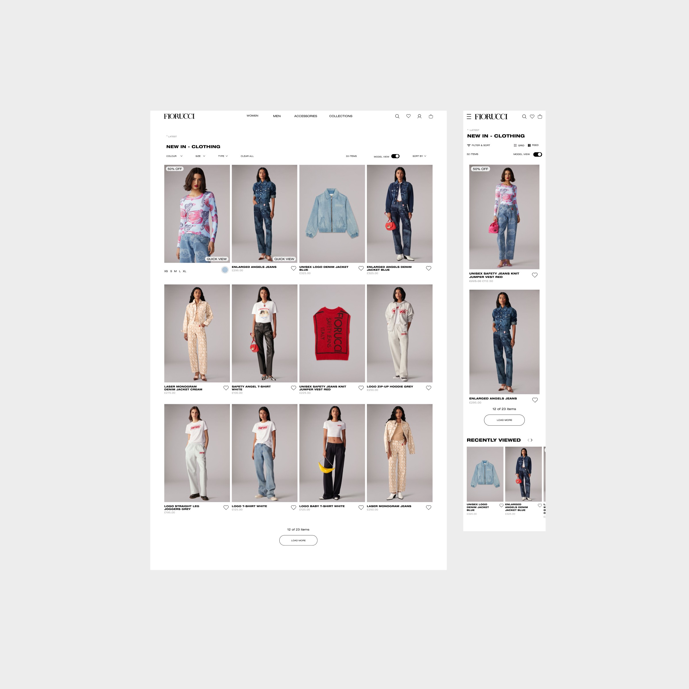
Collection Feature Page

Project Landing Page
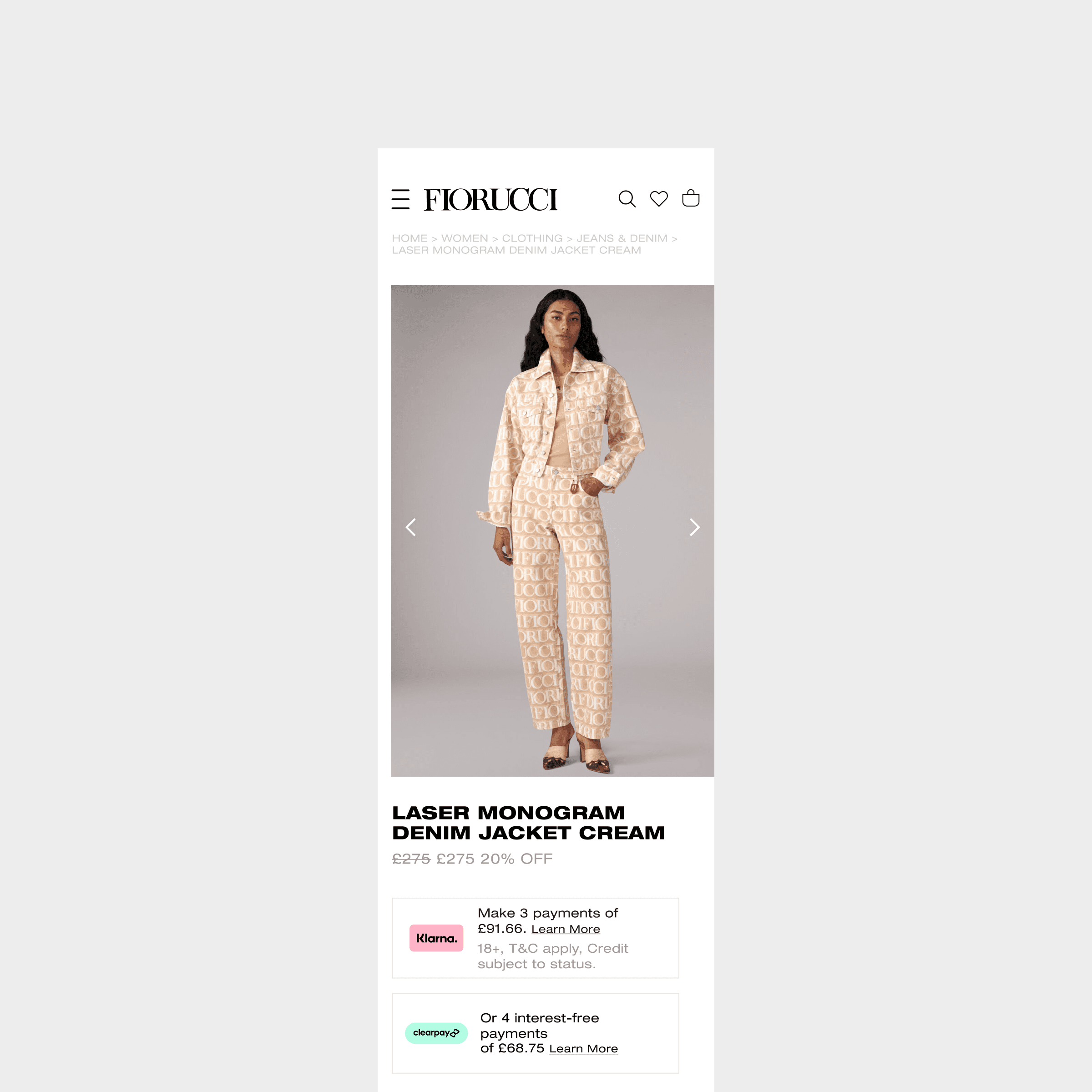
Mobile PDP
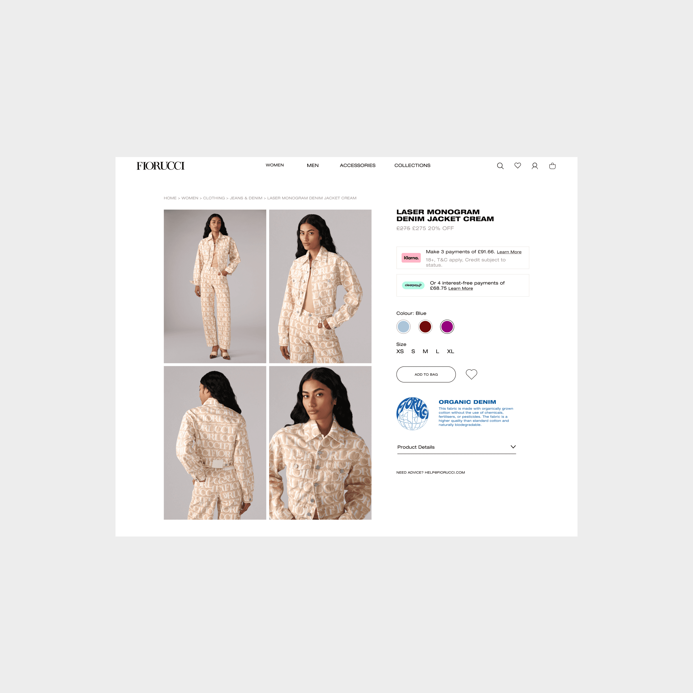
Desktop PDP
Outcome and Results
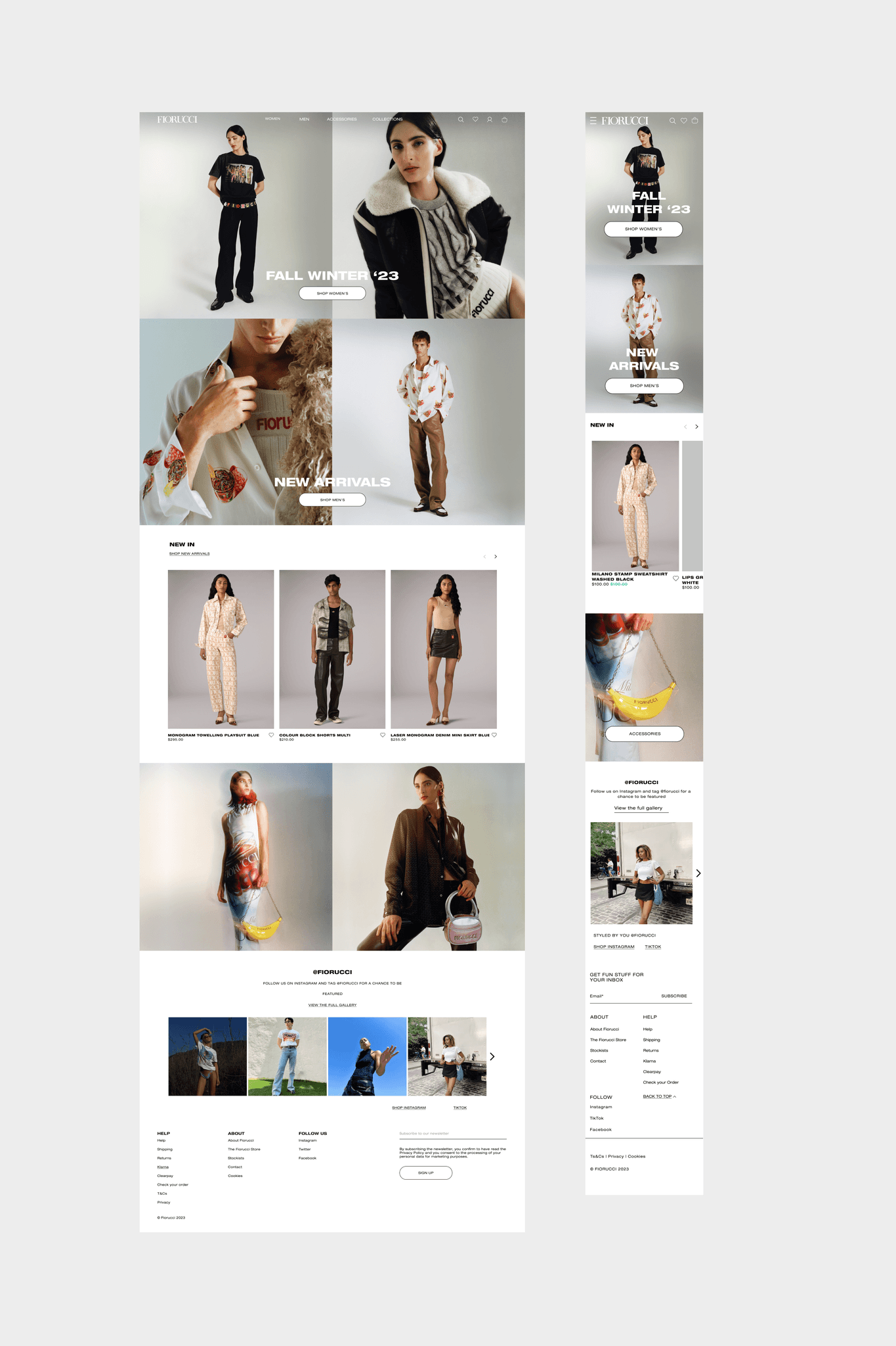
My design work successfully bridged the gap during a critical transitional period for the business, adhering to refreshed brand guidelines and UI design best practice. The overall layouts and designs were refined to be cleaner and more campaign imagery focused to establish a more premium aesthetic. The final outcome was a modern, sophisticated website that significantly enhanced Fiorucci’s e-commerce channel.
“The redesigned site menu includes more granular subcategories and clickable visual icons for more efficient navigation. During Fiorucci’s complete website rebuild, emphasis is placed on preserving the brand’s site aesthetics for customers while facilitating robust online trading.”
Homepage